In malaysia
gaharu coffee in Malaysia are mainly sold in various supermarkets and shopping malls, and markets coffee . there are some hot food store with a coffee machine, coin you can drink.
Small package can be design into different styles and then the small retail packaging, sold separately.with different packaging to retail colours ,has different mood
every day ,have a good mood,can buy red,bad mood can buy blue .
China:
gaharu coffee consumer groups in China, mainly students and white-collar workers. Where students with high school and college-based, white-collar workers mainly young people
In recent years, coffee consumption market continues to heat up, with the growth of the market economy, the wave of coffee culture influence the Chinese city. Coffee consumer groups continues to grow. Insiders predicted that even by 10% growth rate, China's coffee market is very large, by 2020, China will become the world's largest coffee consumer market.
gaharu is herbal coffee plant in the Chinese people's understanding of the natural, gaharu is a plant, so the Chinese people more easily accept this coffee,
Often appear fake products in China, so people are always worried about eating some foods contain chemical substances, when people hear gaharu plants and they will attract people to buy, in China, people are very natural products trusted
In japan
In fact, over the years it has been selling coffee products, so when these products as gifts on holidays, there must be "special" significance. The coffee production, and not to go advanced guide, the most important is to make a gift to provide goods. In winter it can hot drinks, cold drinks in the summer can widely satisfy
Diversified needs of consumers. One response to consumer-oriented means of diversification that is, having a diversified commodity performance, universal nature. Especially fast food, this is more important universal.
In Japan, women are generally at home doing housework, Nestle's use of general retail route to sell products, Nestle products are mainly kinds of convenience products. This product must allow consumers (especially housewives) can buy anywhere, and therefore, we must make the product popular in general retail stores.
So give the coffee packaging design are not the same, each package of color are not the same, when women buy coffee, you can buy based on their favorite color, make a purchase based on their mood.
In Japan, the basic work is a man, therefore, gaharu to enter the Japanese market, have to have advertising, advertising to let interested men, may feel the Japanese man, drinking coffee gaharu unlimited energy, give the impression that a lot impact
In Switzerland
Switzerland has the world's leading chemical and pharmaceutical companies. Basso area is famous factories agglomerations in Europe, its dense degree than most industrial city in Europe. Accordingly, Switzerland is a highly industrialized country per capita income among the best.
However, a hundred years ago in Switzerland is the center of agricultural Livestock force, is a typical agricultural founding countries. gaharu herbal coffee is coffee, so people are more convincing agricultural country, so that people can rest assured that the purchase of goods, Switzerland is also famous factories in Europe gathered, so more conducive to the sale of coffee and coffee production
Switzerland has the best dairy, gaharu add milk,this coffee will different with other counties.
2016年1月21日星期四


Final packaging
This is my last package, my box of colors are red and green, on top of the box with my logo, packaging has a belt, the belt is white color, with me on top of some elements, these are some of the abstract plants , roots, there are some patterns of plant some plants, these motifs and patterns on small packaging is the same, but different arrangements


2016年1月20日星期三
package


This is my first time of packing, I changed the packaging of shapes and colors,
pictures, first, I used to make coffee color and white packaging, before I do
logo on top, I also drew some circles these circles represent the coffee beans.
Second, I used the coffee color as the color of packaging, I put the logo, I
also made a graph, write on the gaharu coffee, as well as on the introduction
of Gaharu coffee,
small package


This is a small package of coffee, I painted a package into two faces, the
above is an abstract coffee cup, coffee cup hot coffee cup on top of both, is
gaharu herbaceous roots, next to some leaves, herbs, elements of the plant, the
following is coiled up gaharu roots, so the performance of the coffee abstract
herbs, from top to bottom is symmetrical, such a design, let's get this bag of
coffee, without positive and negative, respectively, whether you Helena is
which side are positive. I put the coffee color design different packages, each
package is not the same color, a small bag there are two large color, these
colors represent different mood, people want to drink coffee gaharu, you can
have a good mood。
target audience


the international sales market, I analyzed the sales groups, they work long
hours, are a young group, they need to give us stimulus coffee, coffee the
ingredients are herbs, this herb can protect people's voice, so that consumers
can be more at ease. This is the analysis of Malaysia, through the analysis of
Malaysia, I can in this way, to other countries, statistical data and analysis,
thus promoting the international coffee sales gaharu
modified the logo

on the front, and the front I drew a cup, because gaharu is to add herbs, and
then I put the cup on the front, then a leaf would fall in the cup leaves is to
represent the gaharu, coffee word in the o, I was drawn into the beans, I
painted the word coffee on a green leaf, in telling consumers that the coffee
is herbal coffee, can give consumers a fresh feeling.
I just started to leaf color is yellow, because gaharu are sandalwood,
sandalwood and coffee is a color, the leaves have a word gaharu and leaves
coffee on my painting is green, so you can reflect gaharu herbaceous and also
It reflects gaharu color.
I modified the logo colors and fonts, I added a cup of green leaf color change
do unifies two leaf color, I modified the gaharu coffee small print.
digital logo

on the front, and the front I drew a cup, because gaharu is to add herbs, and
then I put the cup on the front, then a leaf would fall in the cup leaves is to
represent the gaharu, coffee word in the o, I was drawn into the beans, I
painted the word coffee on a green leaf, in telling consumers that the coffee
is herbal coffee, can give consumers a fresh feeling.
I just started to leaf color is yellow, because gaharu are sandalwood,
sandalwood and coffee is a color, the leaves have a word gaharu and leaves
coffee on my painting is green, so you can reflect gaharu herbaceous and also
the color reflects the gaharu
Deformation logo

This is my coffee logo's evolution, the beginning I put in touch with cartoon
logo together, I hope to embody coffee through a combination of cartoon images
and letters.
Because gaharu coffee is herbal coffee, so I wanted to paint some plants,
reflecting gahahru characteristics, gaharu letter where a and u, I used coffee
cup to show, a coffee cup is a plan view to show, u is coffee cup side view.
The second logo I put gaharu using anthropomorphic approach, the gaharu letters
painted look like there is life, there is a foot of each letter, just like you
want the same service for the guests, each letter has a eyes, gaharu inside a
coffee bean I express, u is the cup of hot coffee, the whole word appears to be
a living, it seems like the coffee shop waiter, waiting for the guests brought
a cup to a cup of hot coffee.
The third logo was last used my logo, I do not have the word gaharu logo on the
front, and the front I drew a cup, because gaharu is to add herbs, and then I
put the cup on the front, then a leaf would fall in the cup leaves is to
represent the gaharu, coffee word in the o, I was drawn into the beans, I
painted the word coffee on a green leaf, in telling consumers that the coffee
is herbal coffee , can give consumers a fresh feeling.
2016年1月18日星期一
Old Analysis

Old Analysis:
The disadvantage is that the old package: logo not clear enough, can not let pe
ople quickly recognizable, logo large, logo no iconic, packaging is not creative,
and most of the coffee packaging, like boxes of pictures is also very common, c
an not. let people remember this coffee.
Old packaging advantages: packing box is very easy for people to accept, the col
or is very fresh, so that people can feel this product is the herb of the
package, with a white and brown, so it looks very comfortable, very fresh, not
very heavy, logo's colors are green, so that people can feel that this product
is and herbaceous related.
The old logo main color is the color of coffee, and a little green, green represents the
gaharu color because gaharu herbaceous plants.
The main selling point of this product is gaharu coffee gaharu, gaharu most of the
production in Indonesia and Malaysia, gaharu is an herb, add in coffee, can protect his
voice, so that people who drink coffee regularly throat felt very comfortable
or is very fresh, so that people can feel this product is the herb of the
package, with a white and brown, so it looks very comfortable, very fresh, not
very heavy, logo's colors are green, so that people can feel that this product
is and herbaceous related.
The old logo main color is the color of coffee, and a little green, green represents the
gaharu color because gaharu herbaceous plants.
The main selling point of this product is gaharu coffee gaharu, gaharu most of the
production in Indonesia and Malaysia, gaharu is an herb, add in coffee, can protect his
voice, so that people who drink coffee regularly throat felt very comfortable
2016年1月4日星期一
logo analysis

constituted, logo looks very complicated, not simple and can not directly
express the spirit of the product, font does not feature.
Gaharu the beginning I did not know what it meant, I think we should let
everyone into easily understood terms, this term is limited to Malaysians, this
is not conducive to the promotion of products, many Malaysian Chinese do not
know what that means, you can not understand important local products. So
gaharu should use simple and easy to understand words, this will be more people
to buy.
logo looks scattered, looks very messy, logo should be clear so that people can
not go guess this is what it means.
Product Analysis

Learn about our aloe Cafe
What is Sandalwood (Karas)?
Aloe also known as Karas or Depu and in Arabic called Oudh and in Japanese is called Jin-ko. In Sanskrit the word 'Agaru' means wood that sinks.
GAHARU CAFE
Is premixed coffee extract and aloe leaf herb based options, it is a range of premium quality herbal coffee by taste good appetite again menyergarkan own without compromise.
We only use high-quality ingredients that have made the process of investigation by the Universiti Putra Malaysia (UPM) and herbal believed that we use is full of nutritional value without a doubt.
To create perfection in our Café aloe products took a long time to produce high quality products to meet customer demand, which are valued and respected. Coffee bean extraction process is done so perfectly by storing all essential oils, flavors and selected herbs.
In the world of Islam, the Arabs have used aloe since hundreds of years ago.
Prophet never narrated:
Um Qays bint Mih-shon r.ha said: "I heard from the Prophet said:
Use GAHARU because it contains 7 species such as sore throat cure and can also be used for low back pain .. "
(Hadith Sahih Bukhari & Muslim)
Agarwood is from Thymelaeceae family. Referring to data from the World Conference on Vietnam aloes, it appears 25 species of Aquilaria species that have high commercial value.
The final word from us
Peace of Mind
Refreshing Body
Electric power
ONLY IN CAFE GAHARU
logo 3
The first logo design is too fragmented, I modified, because the
characteristics of this product are sandalwood, products are coffee, sandalwood
Malay is GAHARU, products are cafe, the first letter of sandalwood is G,
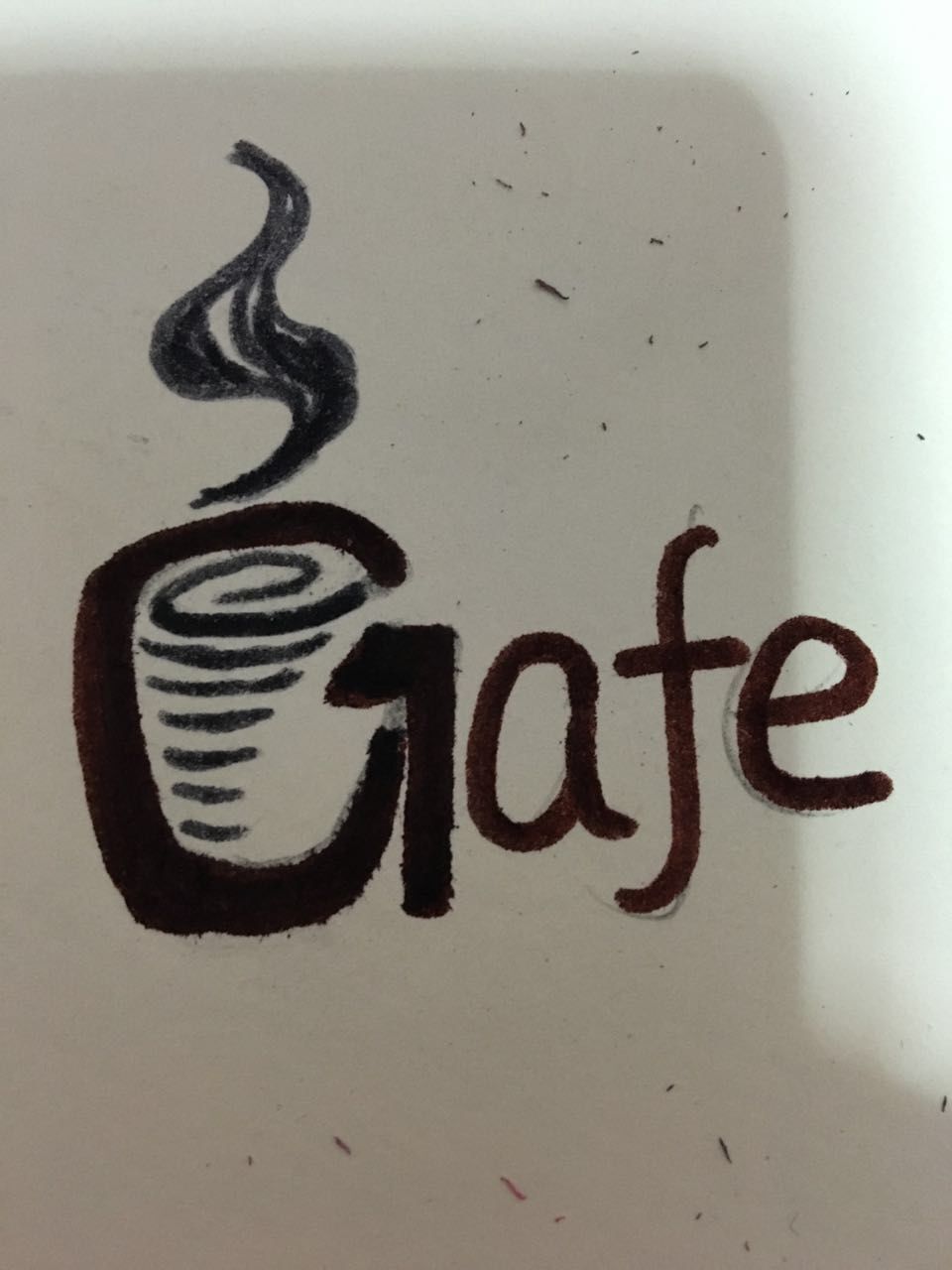
However, we drink a cup of coffee is to drink, I see the cup, I discovered that
the left edge of the cup is a feature, with a little imagination is G, however,
remove the point is C, G is GAHARU, C is the cafe, below I draft
I used to make a digital logo, cup takes the form of hand-painted, logo reflect
the characteristics of the place I used green, because there are trees of
elements in it, because the logo pictures more casual, so I would look for a
regular font logo some, this logo looks just balance

characteristics of this product are sandalwood, products are coffee, sandalwood
Malay is GAHARU, products are cafe, the first letter of sandalwood is G,
However, we drink a cup of coffee is to drink, I see the cup, I discovered that
the left edge of the cup is a feature, with a little imagination is G, however,
remove the point is C, G is GAHARU, C is the cafe, below I draft
I used to make a digital logo, cup takes the form of hand-painted, logo reflect
the characteristics of the place I used green, because there are trees of
elements in it, because the logo pictures more casual, so I would look for a
regular font logo some, this logo looks just balance

logo 2
The first logo design is too fragmented, I modified, because the
characteristics of this product are sandalwood, products are coffee, sandalwood
Malay is GAHARU, products are cafe, the first letter of sandalwood is G,
However, we drink a cup of coffee is to drink, I see the cup, I discovered that
the left edge of the cup is a feature, with a little imagination is G, however,
remove the point is C, G is GAHARU, C is the cafe, below I draft


characteristics of this product are sandalwood, products are coffee, sandalwood
Malay is GAHARU, products are cafe, the first letter of sandalwood is G,
However, we drink a cup of coffee is to drink, I see the cup, I discovered that
the left edge of the cup is a feature, with a little imagination is G, however,
remove the point is C, G is GAHARU, C is the cafe, below I draft

logo
This is my first design of logo, I like old sandalwood tree changed so that
looks interesting, not the original shape of the tree relatively old-fashioned,
Leaf has also been modified, the original leaf as normal leaves, like
everywhere, I put the leaves into the branches, I also added a cup of the way,
because we drink coffee in the coffee shop will have a pattern, so it looks
more interesting
The logo I used two colors, one is coffee color, one is green leaves, so that
not only embodies the coffee, have reflected the characteristics of products


looks interesting, not the original shape of the tree relatively old-fashioned,
Leaf has also been modified, the original leaf as normal leaves, like
everywhere, I put the leaves into the branches, I also added a cup of the way,
because we drink coffee in the coffee shop will have a pattern, so it looks
more interesting
The logo I used two colors, one is coffee color, one is green leaves, so that
not only embodies the coffee, have reflected the characteristics of products


Product Analysis
I chose the product is packaged coffee, the coffee is coffee produced in
Malaysia, after my investigation, I found that the coffee is a component
containing aloe and sandalwood, this coffee Logo have gaharu, this word is
Malay in sandalwood mean, here is the coffee original design


I think the original Logo too complicated, the whole package looks complicated,
it should be easy to change the logo of some, let people glance, the logo
design interesting, so make the product more sellable, original logo in a tree on
behalf of sandalwood tree
Malaysia, after my investigation, I found that the coffee is a component
containing aloe and sandalwood, this coffee Logo have gaharu, this word is
Malay in sandalwood mean, here is the coffee original design


I think the original Logo too complicated, the whole package looks complicated,
it should be easy to change the logo of some, let people glance, the logo
design interesting, so make the product more sellable, original logo in a tree on
behalf of sandalwood tree
modify
This week I changed my group work, before I chose chicken, bicycles, bells, I
do not, the idea is not clear enough, the expression is not accurate, this week
I changed my choice, I chose the chicken , bells, baskets, or selling my chick,
chick sells, I still think of it as pets, not food, like puppies, kittens, I
design the amount that can be installed basket chick, bells hang on the chick's
neck, so the chick will go audible, particularly interesting.
It may also be a chick dressed as people give puppy clothes, I design is to
wear sexy bikini chick, or special things on the dress, I was inspired by the
Victoria's Secret
You can wear to a variety of bikini chick, chicken wings dress to look like
Victoria's Secret wings, like the time when the chicken wings, like an angel,
so that people will feel chick cute, there will be the desire to buy.


do not, the idea is not clear enough, the expression is not accurate, this week
I changed my choice, I chose the chicken , bells, baskets, or selling my chick,
chick sells, I still think of it as pets, not food, like puppies, kittens, I
design the amount that can be installed basket chick, bells hang on the chick's
neck, so the chick will go audible, particularly interesting.
It may also be a chick dressed as people give puppy clothes, I design is to
wear sexy bikini chick, or special things on the dress, I was inspired by the
Victoria's Secret
You can wear to a variety of bikini chick, chicken wings dress to look like
Victoria's Secret wings, like the time when the chicken wings, like an angel,
so that people will feel chick cute, there will be the desire to buy.


Group work continued
This week we continue the previous group work, continue to improve, we came up
with the name of the product and some of the material, product strengths and
weaknesses, as well as for sales in which countries
Many names came up, some of the names were rotan ( basket ), rotan boy, bag and
pack up. We expect the application of waterproof material, as well as with
wheels, and go shopping is also very convenient, if sold, then we should be low-
priced sales, so people will buy more if the price is expensive, then people
will buy a few materials should follow this, environmental protection, low-cost
materials, such products more selling,We were also to identify our
international market, such as the U.S.A. , France, China and Ghana based on
population size and our target audiences.


with the name of the product and some of the material, product strengths and
weaknesses, as well as for sales in which countries
Many names came up, some of the names were rotan ( basket ), rotan boy, bag and
pack up. We expect the application of waterproof material, as well as with
wheels, and go shopping is also very convenient, if sold, then we should be low-
priced sales, so people will buy more if the price is expensive, then people
will buy a few materials should follow this, environmental protection, low-cost
materials, such products more selling,We were also to identify our
international market, such as the U.S.A. , France, China and Ghana based on
population size and our target audiences.


group work
This week we have a group work, the teacher gave us four pictures, we need to
elect three are combined, then go to sell products. Pictures are, chicken,
bicycles, bells, bananas, basket
My classmates were elected to sell its own products, a student is selected
basket, bananas, chicken, a classmate chose baskets, bells, bicycle, and a
classmate choice is chicken, bicycles, bells, I choose is the bicycle, bell,
chicken.
My idea is: I put three pictures together, I chose the chicken, bicycles,
bells, I mainly sell chicken, I put the chicken as pets look like dog, cat,
like, not just food, saw this a few pictures, the front surface of the screen
is a girl sitting on the bike, holding chick, chick hanging bell on his neck,
like a dog's neck will be the same as hanging bell, before people always
holding puppy, Now it can hold the chicken, food is not just the people on the
table.


elect three are combined, then go to sell products. Pictures are, chicken,
bicycles, bells, bananas, basket
My classmates were elected to sell its own products, a student is selected
basket, bananas, chicken, a classmate chose baskets, bells, bicycle, and a
classmate choice is chicken, bicycles, bells, I choose is the bicycle, bell,
chicken.
My idea is: I put three pictures together, I chose the chicken, bicycles,
bells, I mainly sell chicken, I put the chicken as pets look like dog, cat,
like, not just food, saw this a few pictures, the front surface of the screen
is a girl sitting on the bike, holding chick, chick hanging bell on his neck,
like a dog's neck will be the same as hanging bell, before people always
holding puppy, Now it can hold the chicken, food is not just the people on the
table.


订阅:
博文 (Atom)